

CASE STUDY
Vox Cinemas App Redesign
Market research
App analysis
User survey
Wireframes
High-fidelty UI
Prototype
What
Native Mobile App
Why
Portfolio Project
Category
Movie Ticket Booking
Where
Mumbai, India
Role
UI/UX Designer
When
Sept 2023 - Oct 2023
Why I made this project
Upon realizing that my relative and his friends in Dubai favored in-person movie ticket purchases because the online process seemed perplexing and unattractive, I scrutinized the application and aimed to suggest improvements in the UI/UX.
What is Vox Cinemas
Vox cinemas is an online movie ticket booking platform and it is the largest and most rapidly growing exhibitor in the Middle East. Currently operating in 14 different countries.
Market Research
The claim
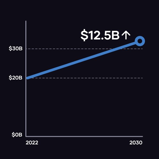
Online Movie Ticketing Services Market size was valued at USD 19.32 billion in 2021 and is poised to grow from USD 20.56 billion in 2022 to USD 33.12 billion by 2030.
The problem
In this highly competitive industry, it is challenging to differentiate oneself in order to attract consumers to utilize your services.
App analysis
After analyzing the Vox cinemas application, I identified four principal UI/UX issues that impact the app's overall user-friendliness.
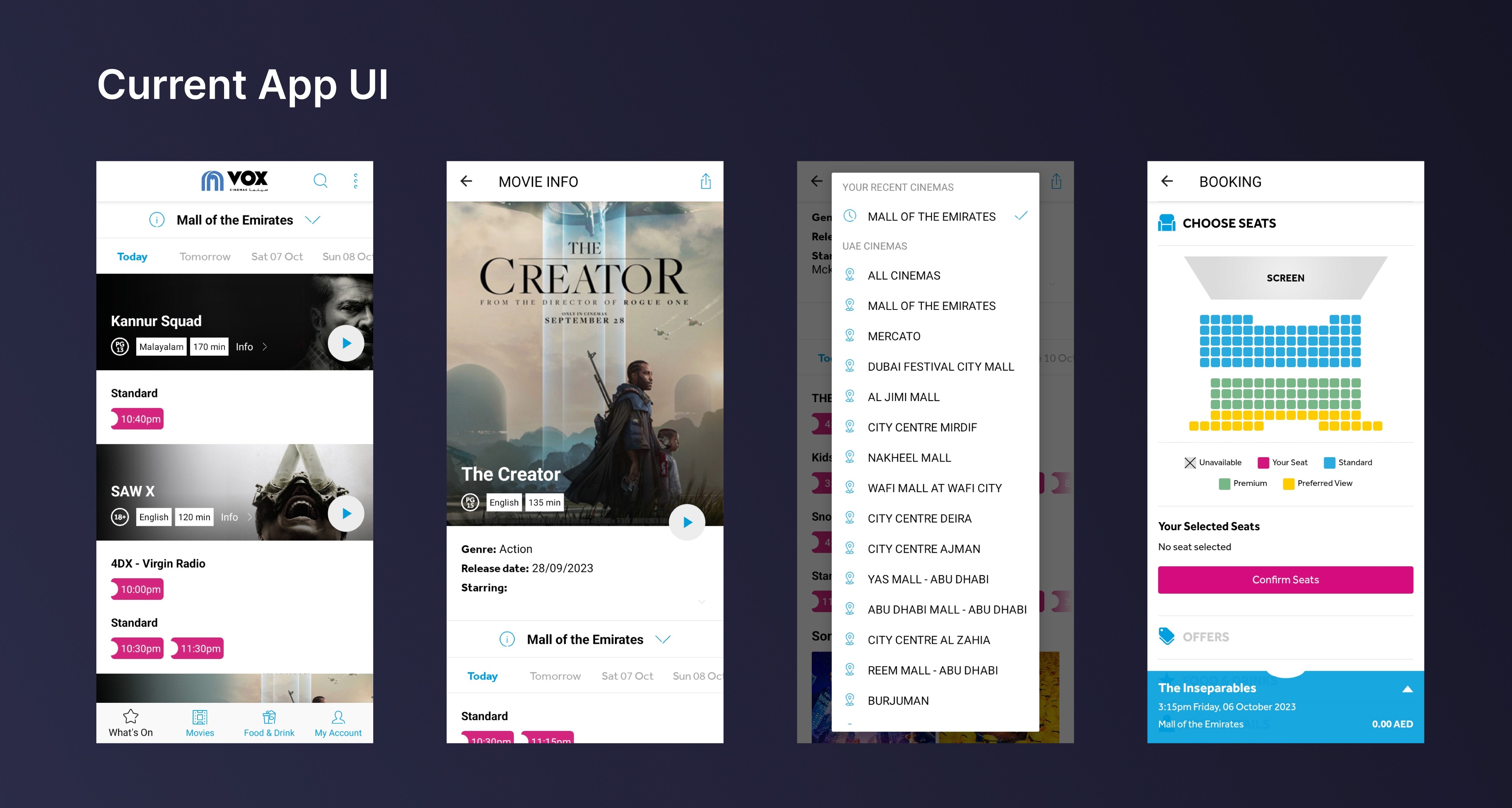
Upon launching the app, the user is immediately presented with films and corresponding showtimes at a specific theater. This may be confusing for a newbie.
The Movie section lacks comprehensive details about the films, and it also hosts theater and time selection, making it seem congested.
The design of the Theatre selection page isn't optimal, permitting the viewing of only one theater at a time and lacking a search feature, leading to a manually intensive hunt for the desired theatre.
Additionally, the Seat selection page exhibits a major flaw: due to the small scale and boldly colored seating arrangements, users struggle to discern and pick available spots.
User Survey
I carried out a swift survey within my relative's social circle.
Result
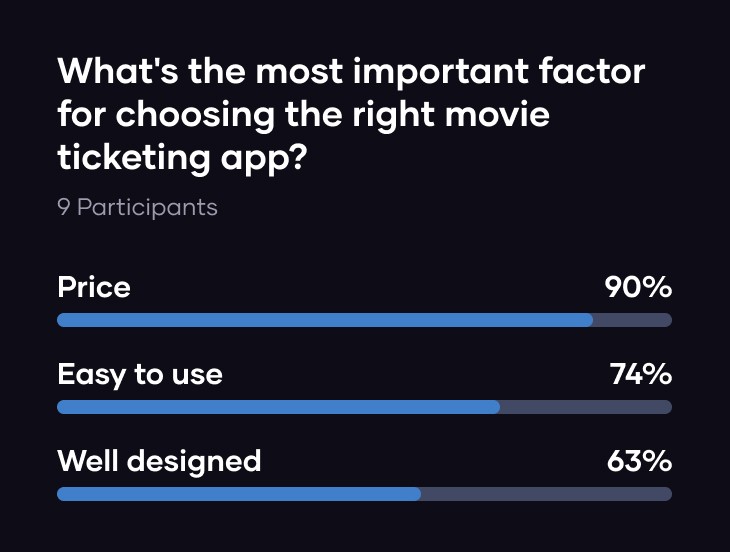
The survey reveals that beyond price, users require a simple and aesthetically pleasing app for their use.
Time to start designing!
Once I went through all my research data, it was time to start designing the initial low-fidelity wireframes.
Low-fidelity wireframes
I sketched multiple design screens and chose the ones which I think would be the best.
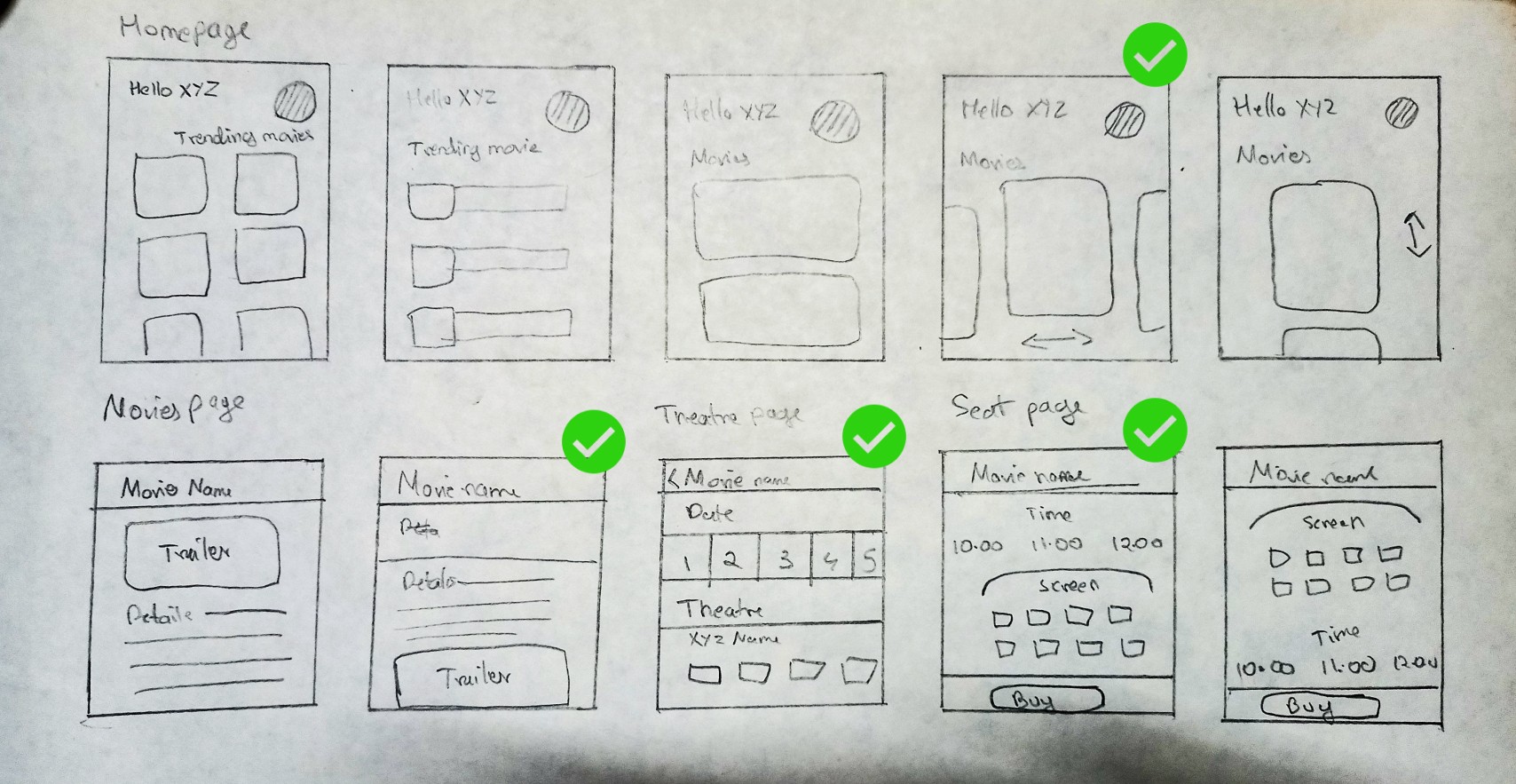
Next, I created digital versions of these wireframes
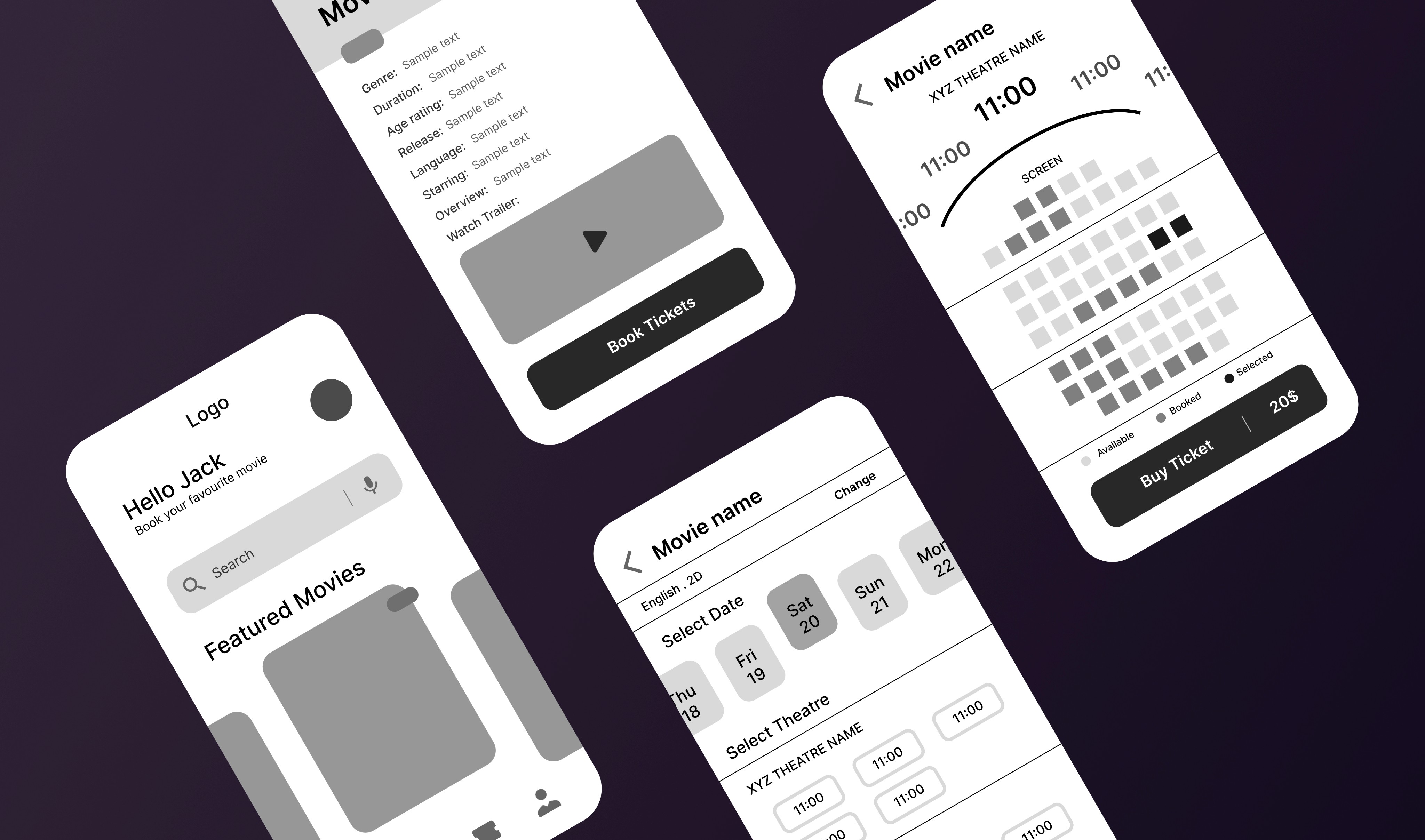
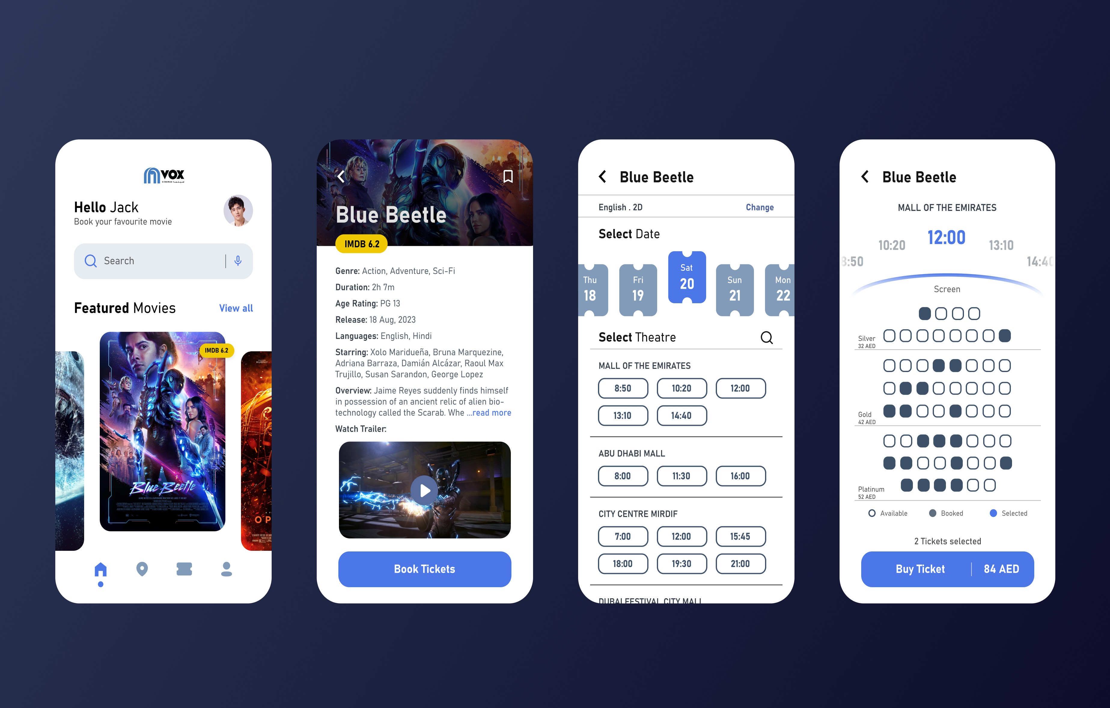
High-fidelity UI
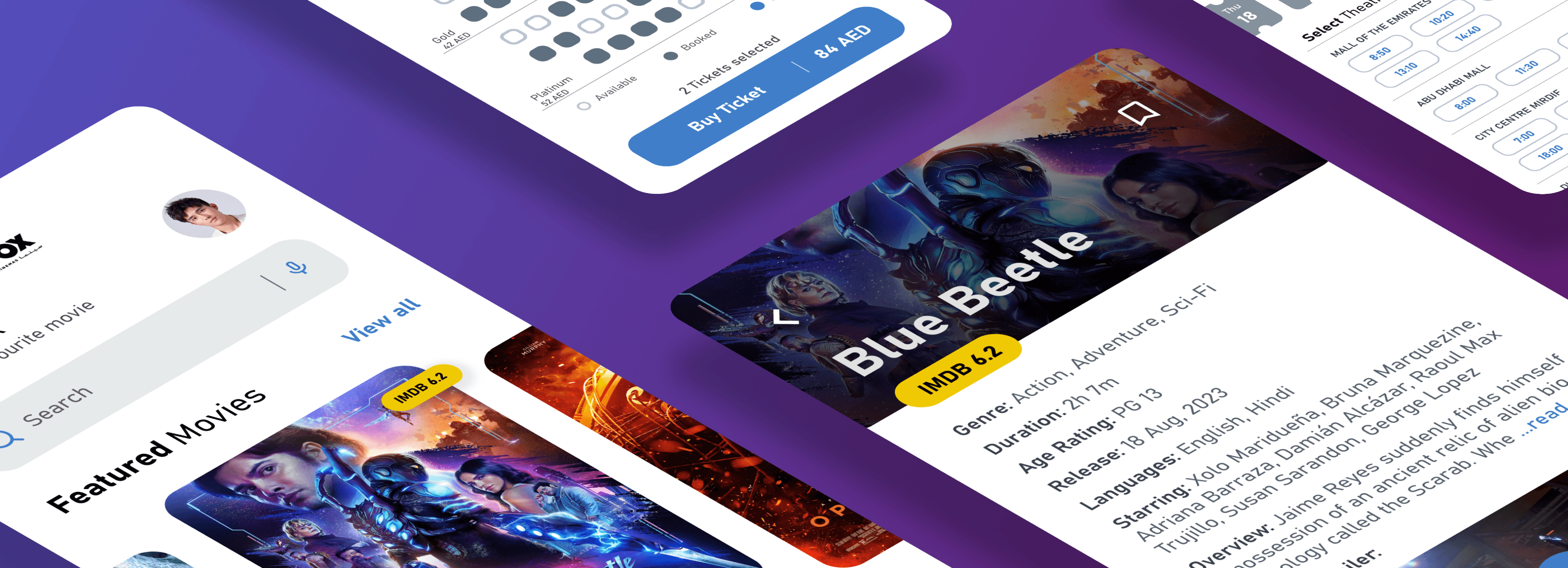
Once the wireframes were complete, I started creating a couple of main screens of the app. I started by defining the fonts and colors. I employed a similar blue accent color as it agrees with the primary brand visual style.
Color palette
Accent, primary, secondary, background
Font
Bahnschrift
AaBbCcDdEeFfGgHh
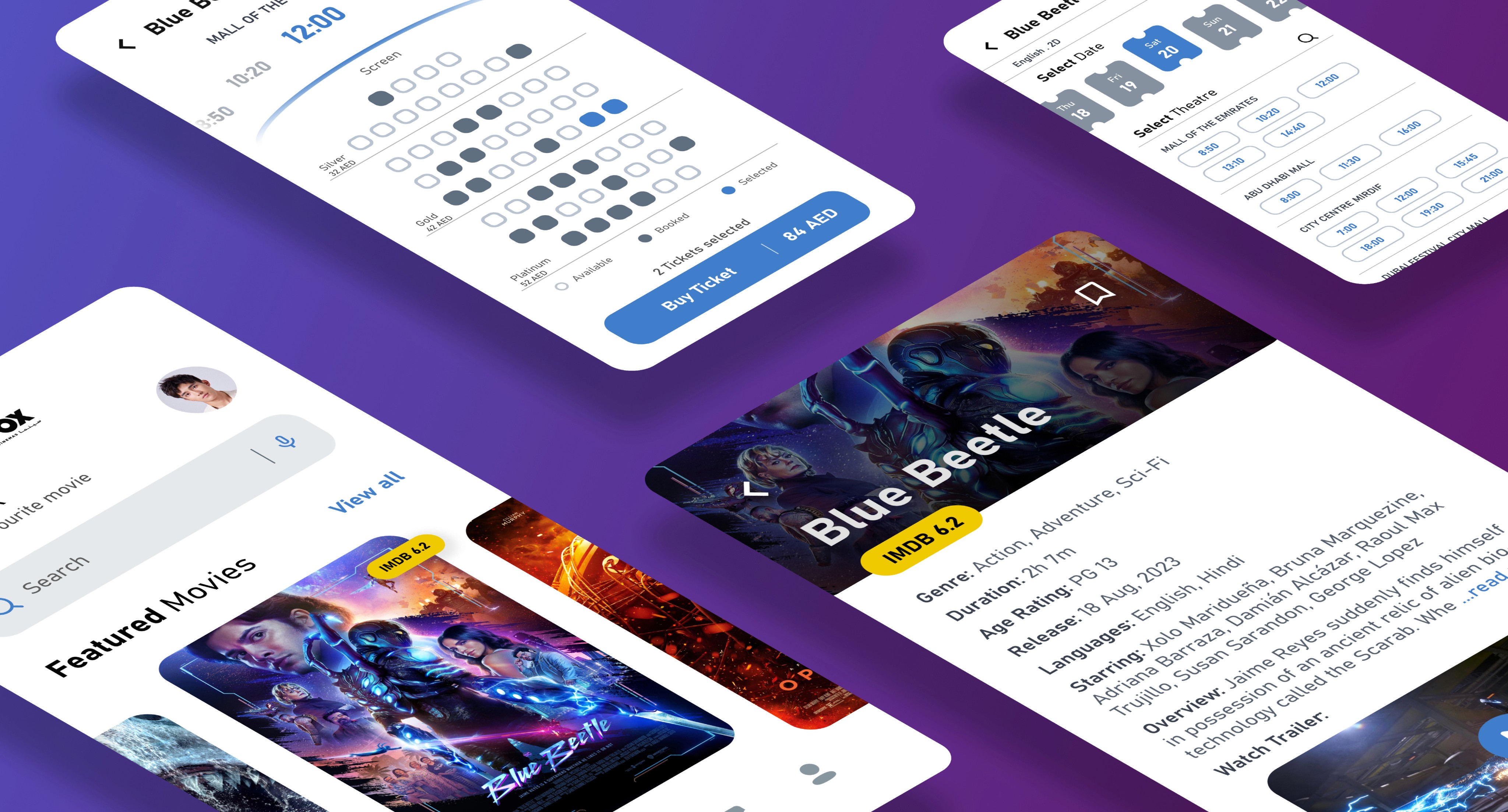
High-fidelity Prototype
Lastly, I connected my high fidelity designs into a animated clickable prototype. That will allow me to test the app on a first group of users. Kindly check the video below,
Testing & Conclusion
Finally to test it out, I gathered feedback from my relative's friends along with a different group of people, who expressed satisfaction and a preference for using such an app to book movie tickets online.
In conclusion, I just want to say that an app like this has the potential to streamline the user experience, attract more customers, and ultimately enhance the company's profitability.
CASE STUDY
Vox Cinemas App Redesign
Market research
App analysis
User survey
Wireframes
High-fidelty UI
Prototype
What
Native Mobile App
Why
Portfolio Project
Category
Movie Ticket Booking
Where
Mumbai, India
Role
UI/UX Designer
When
Sept 2023 - Oct 2023
Why I made this project
Upon realizing that my relative and his friends in Dubai favored in-person movie ticket purchases because the online process seemed perplexing and unattractive, I scrutinized the application and aimed to suggest improvements in the UI/UX.
What is Vox Cinemas
Vox cinemas is an online movie ticket booking platform and it is the largest and most rapidly growing exhibitor in the Middle East. Currently operating in 14 different countries.
Market Research
The claim
Online Movie Ticketing Services Market size was valued at USD 19.32 billion in 2021 and is poised to grow from USD 20.56 billion in 2022 to USD 33.12 billion by 2030.
The problem
In this highly competitive industry, it is challenging to differentiate oneself in order to attract consumers to utilize your services.
App analysis
After analyzing the Vox cinemas application, I identified four principal UI/UX issues that impact the app's overall user-friendliness.
Upon launching the app, the user is immediately presented with films and corresponding showtimes at a specific theater. This may be confusing for a newbie.
The Movie section lacks comprehensive details about the films, and it also hosts theater and time selection, making it seem congested.
The design of the Theatre selection page isn't optimal, permitting the viewing of only one theater at a time and lacking a search feature, leading to a manually intensive hunt for the desired theatre.
Additionally, the Seat selection page exhibits a major flaw: due to the small scale and boldly colored seating arrangements, users struggle to discern and pick available spots.
User Survey
I carried out a swift survey within my relative's social circle.
Result
The survey reveals that beyond price, users require a simple and aesthetically pleasing app for their use.
Time to start designing!
Once I went through all my research data, it was time to start designing the initial low-fidelity wireframes.
Low-fidelity wireframes
I sketched multiple design screens and chose the ones which I think would be the best.
Next, I created digital versions of these wireframes
High-fidelity UI
Once the wireframes were complete, I started creating a couple of main screens of the app. I started by defining the fonts and colors. I employed a similar blue accent color as it agrees with the primary brand visual style.
Color palette
Accent, primary, secondary, background
Font
Bahnschrift
AaBbCcDdEeFfGgHh
High-fidelity Prototype
Lastly, I connected my high fidelity designs into a animated clickable prototype. That will allow me to test the app on a first group of users. Kindly check the video below,
Testing & Conclusion
Finally to test it out, I gathered feedback from my relative's friends along with a different group of people, who expressed satisfaction and a preference for using such an app to book movie tickets online.
In conclusion, I just want to say that an app like this has the potential to streamline the user experience, attract more customers, and ultimately enhance the company's profitability.